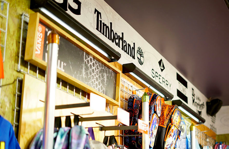
This project, I was tasked to rebrand Journeys, a well-known retail brand owned by Genesco Inc. that specializes in branded footwear and accessories. With approximately 1,200 stores nationwide, Journeys has built its identity around youth culture, offering trendy and affordable shoes, apparel, and accessories from popular brands like Vans, Converse, Dr. Martens, and Nike. Founded in December 1986, its first store opened in Nashville, Tennessee, and has since expanded throughout the U.S., Puerto Rico, and Canada, operating mainly in malls and online. The brand’s mission emphasizes individuality, self-expression, and inclusivity, while its vision positions it as a leader in youth fashion, continually evolving to meet fast-changing trends. Initiatives like “Journeys Second-Hand” reflect a growing commitment to sustainability. As part of this rebrand, I explored how to modernize the brand’s visual strategy with a more minimalist look while still keeping true to the streetwear-inspired aesthetic. The goal is to transform Journeys from just a footwear retailer into a culturally relevant, lifestyle-driven brand that resonates with a new generation seeking authenticity, creativity, and meaningful experiences.

LOGO
Journeys’ logo showcases a graffiti-like inspired font with arrows that extend from the letters.In a way,this symbolizes movement,change, and youthfulness,core themes that resonate with the brand’s identity and target audience. However, this logo could be improved, as it feels childish and lacks the polish needed for broader brand recognition. Its rough, graffiti-style design may limit its appeal to older teens or young adults looking for a more refined sense of style.
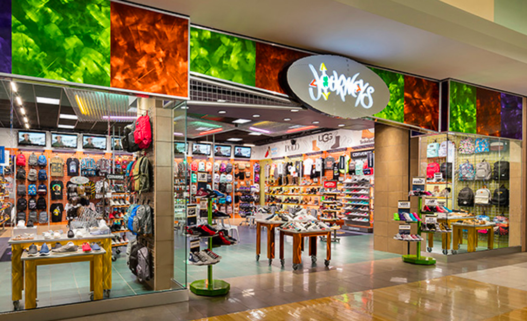
IN-STORE DISPLAY
They have an urban, street-style vibe going on, with walls full of music, athlete posters, and brands that contribute to an energetic and youthful atmosphere. The displays often use gritty textures like concrete, graffiti-style graphics. However, their storefront design seems a bit outdated and inconsistent across locations. While some stores embrace the bold energy of the brand, others feel cluttered or overly generic

SOCIAL MEDIA
Journeys stays active across all major social media platforms, regularly sharing photos of young people wearing trendy, expressive outfits. These posts often feature casual streetwear in real-life settings to highlight authenticity and style. The brand uses this content to stay connected with its audience and reflect current youth fashion trends.
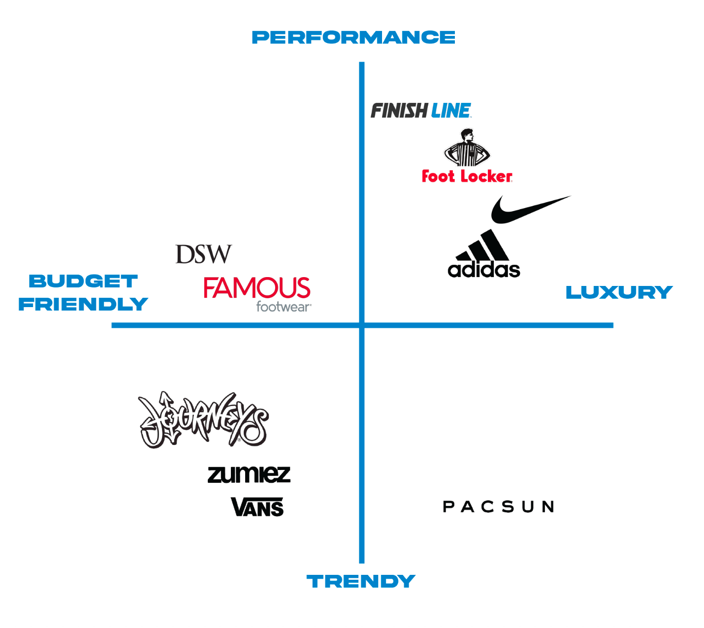
BRAND POSITIONING MATRIX
Journeys is known as a budget-friendly, trendy brand. The new direction keeps this core but adds a more polished and fresh look designed to capture the attention of Gen Z and younger audiences. By combining affordability with a bold, modern style, the brand will stand out in a crowded market and build stronger connections with the next generation of trendsetters.
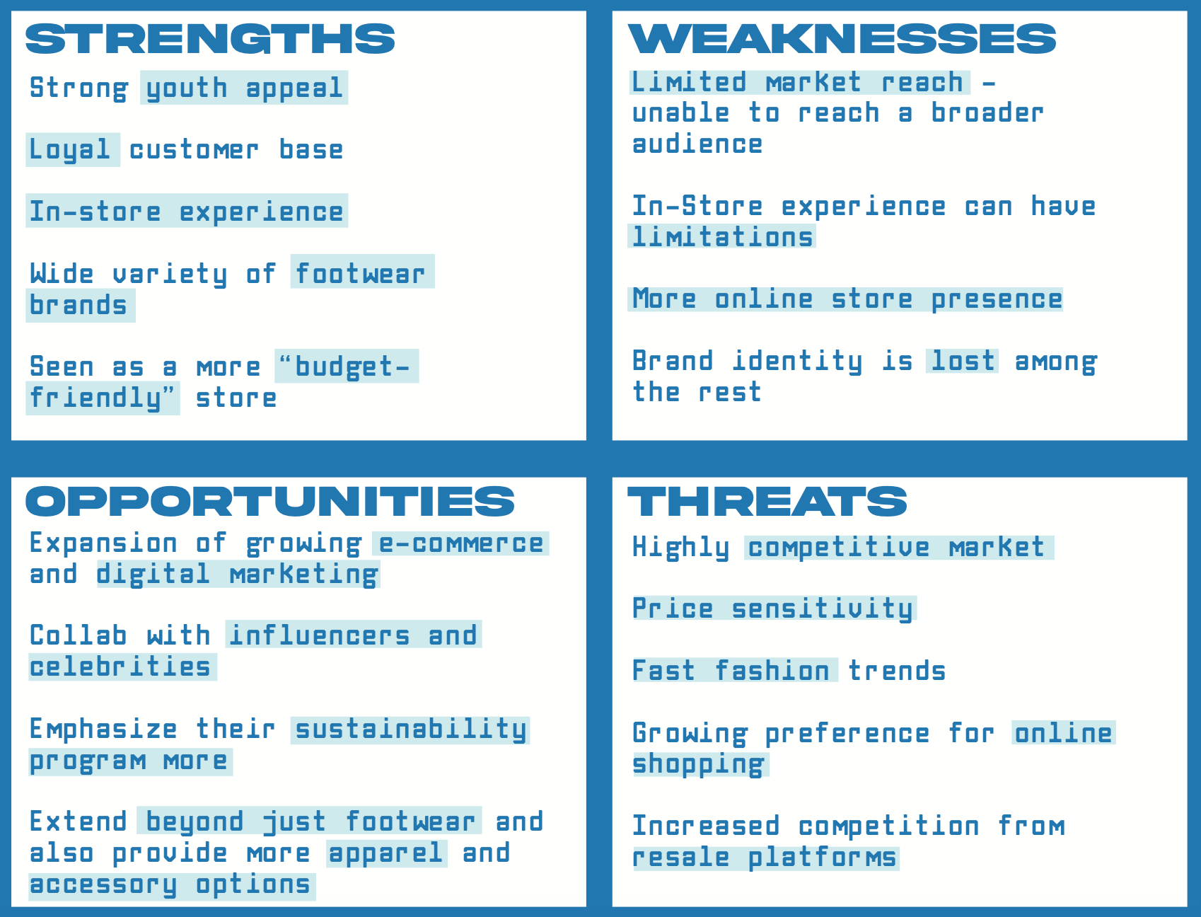

SWOT ANALYSIS
BRAND PERSONAS
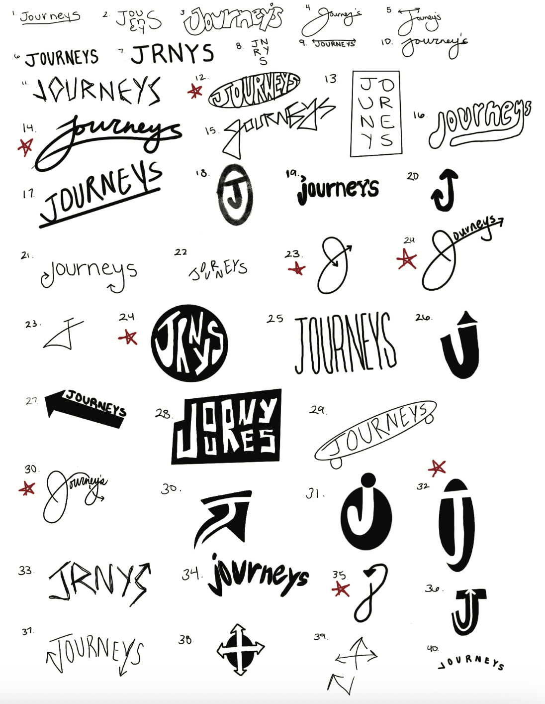
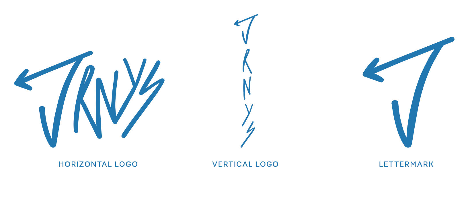
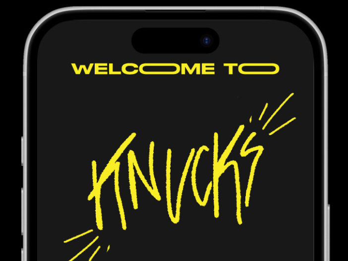
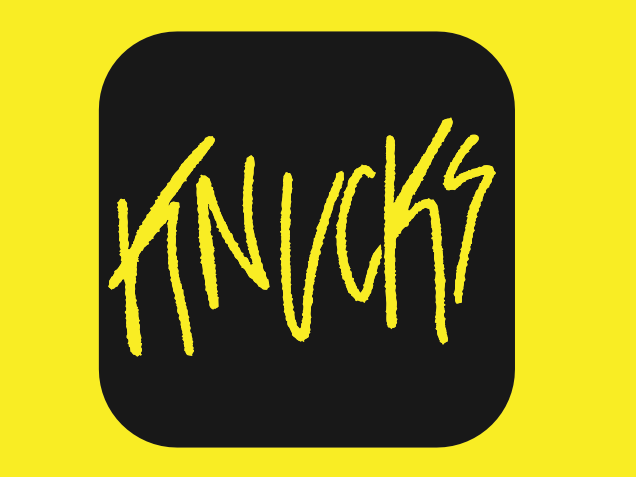
LOGO ITERATIONS & FINAL LOGO
This new logo is an improvement of the old one as it simplifies the design for better readability, modernizes the overall look, enhances versatility across platforms, and introduces a youthful, edgy tone that better connects with a youthful audience. It strikes a balance between clean design and expressive character, making it more adaptable for both digital and physical branding while still capturing the bold, fashion-forward spirit that defines Journeys.
The idea to shorten the word "Journeys" into "JRNYS" was to create a more modern, minimal, and stylized brand identity that aligns with current design trends and resonates with a younger, fashion-conscious audience. This abbreviation not only gives the brand a fresh and edgy feel but also mirrors how language is often abbreviated in digital communication and social media, making it more relatable and memorable. Additionally, the condensed form improves logo versatility, allowing for cleaner application across various mediums like mobile interfaces, packaging, and merchandise without sacrificing brand recognition.

LOGO DO'S AND DON'TS
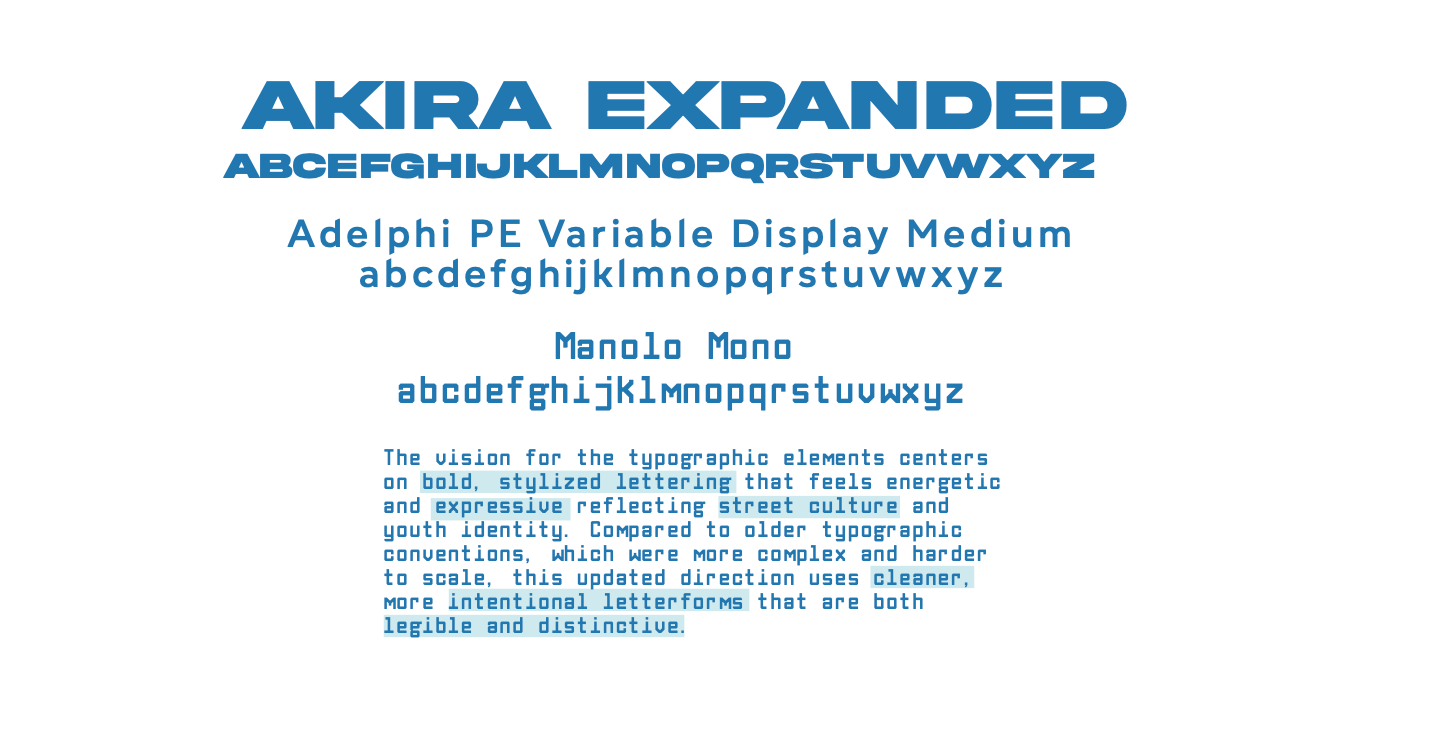
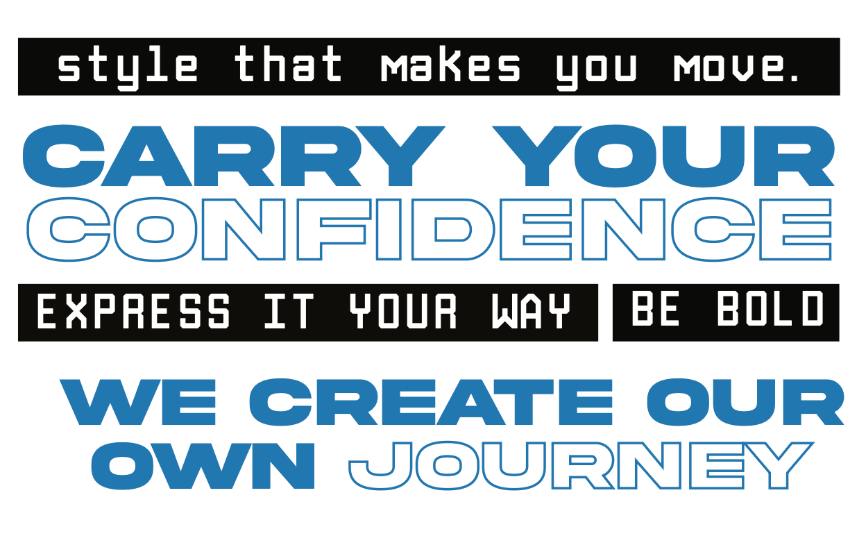
TYPOGRAPHY

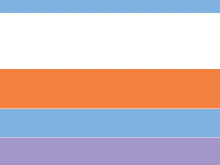
COLORS
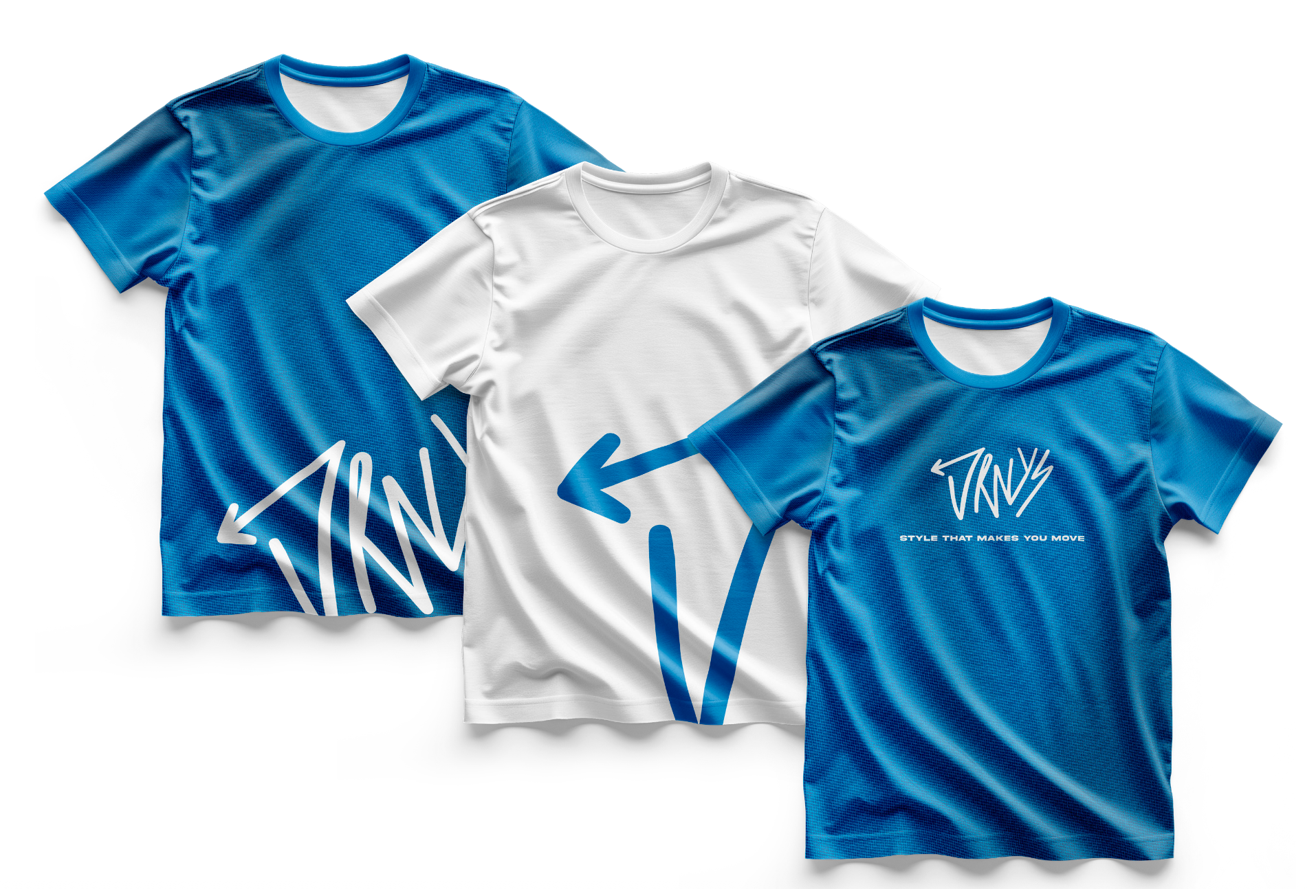
The new color palette is more cohesive and modern, shifting away from high-contrast or overly saturated tones. It introduces a calmer, more versatile range that still feels youthful and street-smart, aligning well with the brand’s edgy, urban aesthetic.
VOICE
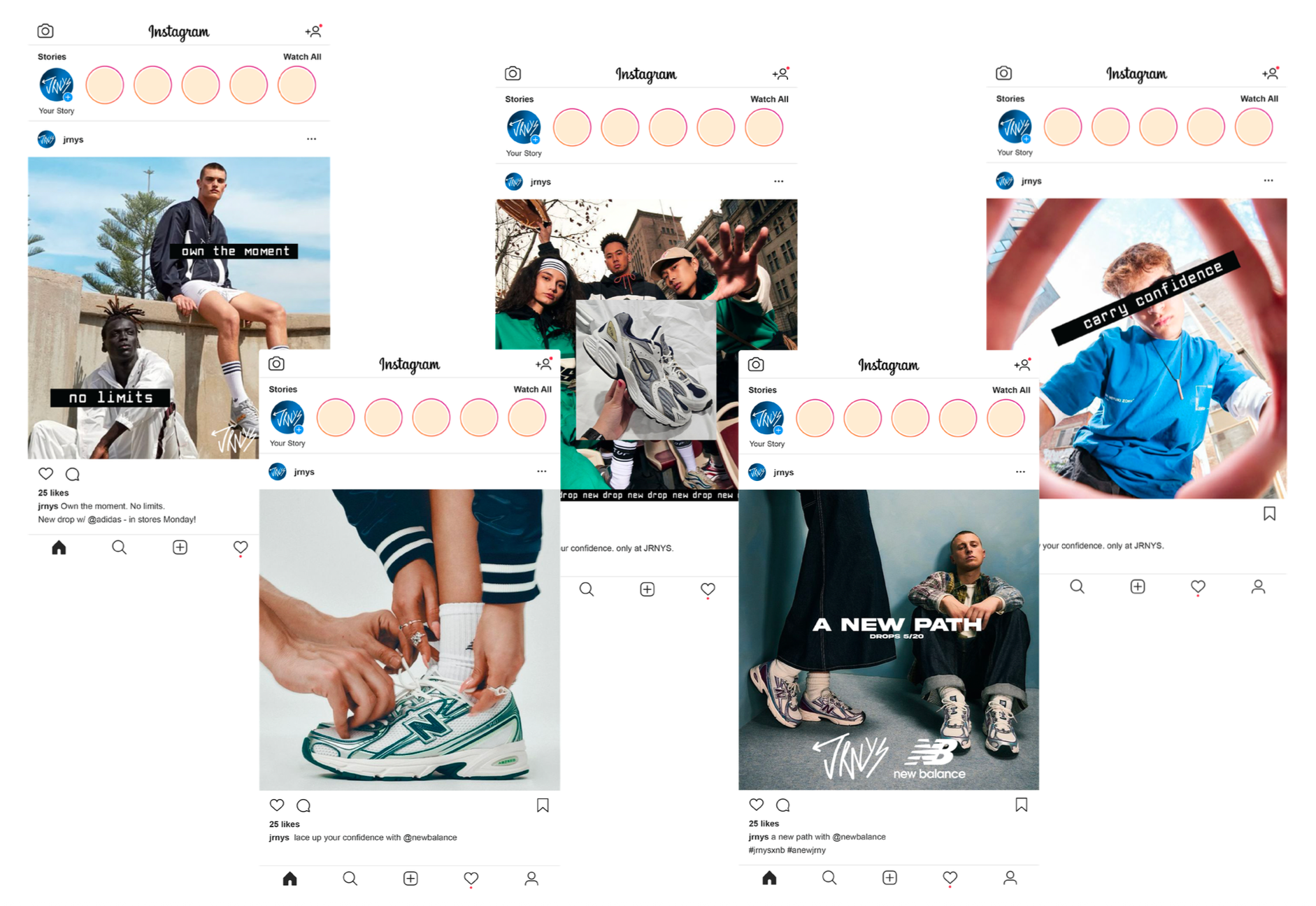
The voice of the JRNYS brand is bold, youthful, and rebellious but intentional. It speaks like a friend who dares you to try something new and unapologetically be yourself. It blends “street-smart attitude” with a tone that’s inclusive and energetic, using short, punchy phrases where appropriate. This is a major step up from the old voice, which may have felt more generic or overly promotional. The new tone resonates more directly with the Gen Z audience and reflects the current culture of embracing confidence and individuality.
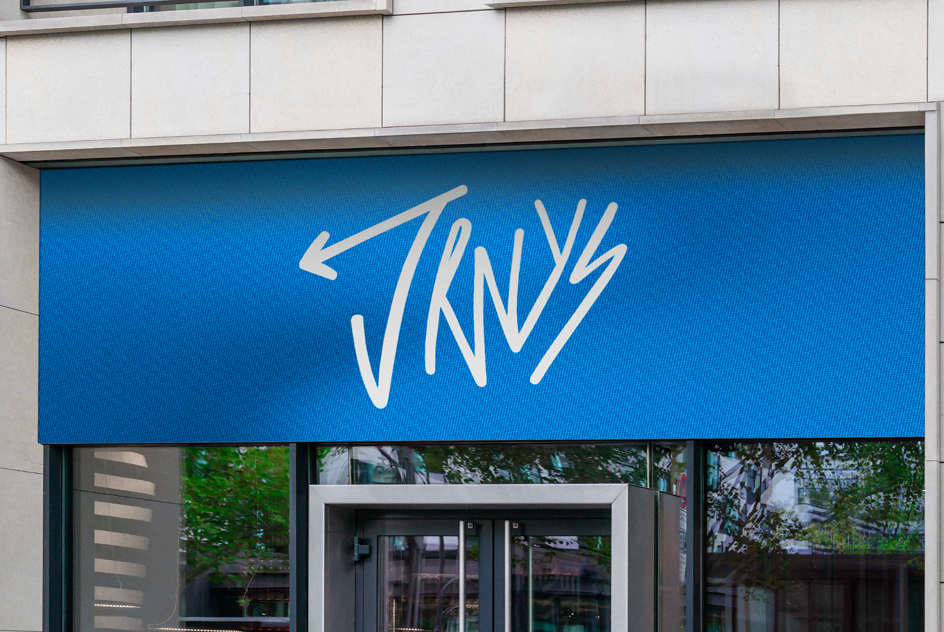
STOREFRONT DESIGN
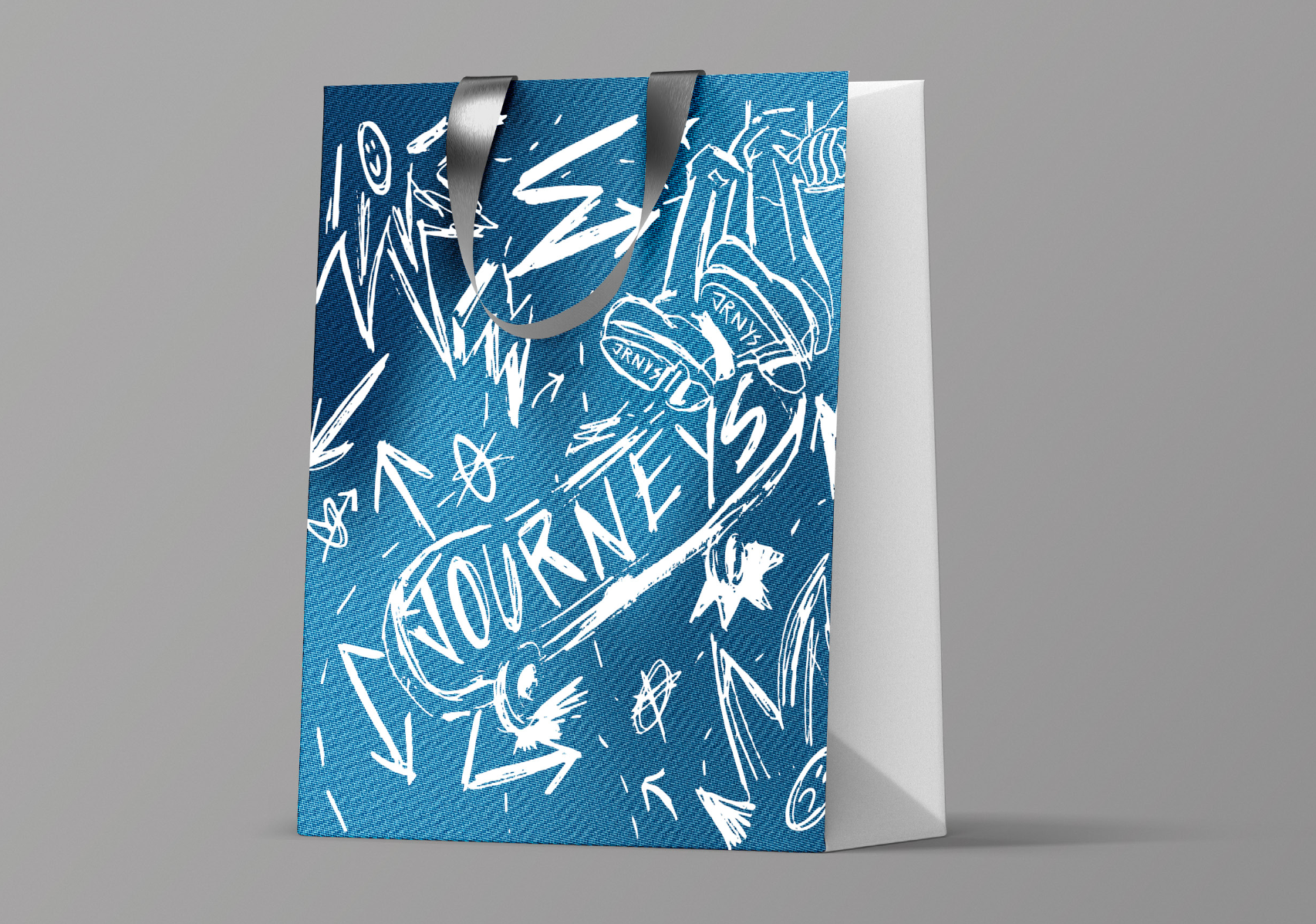
SHOPPING BAG DESIGN
SOCIAL MEDIA
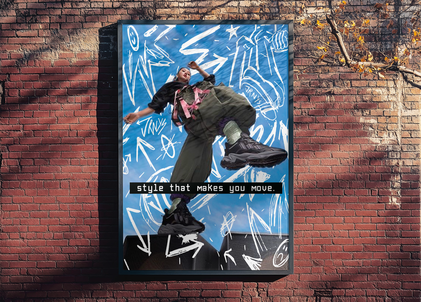
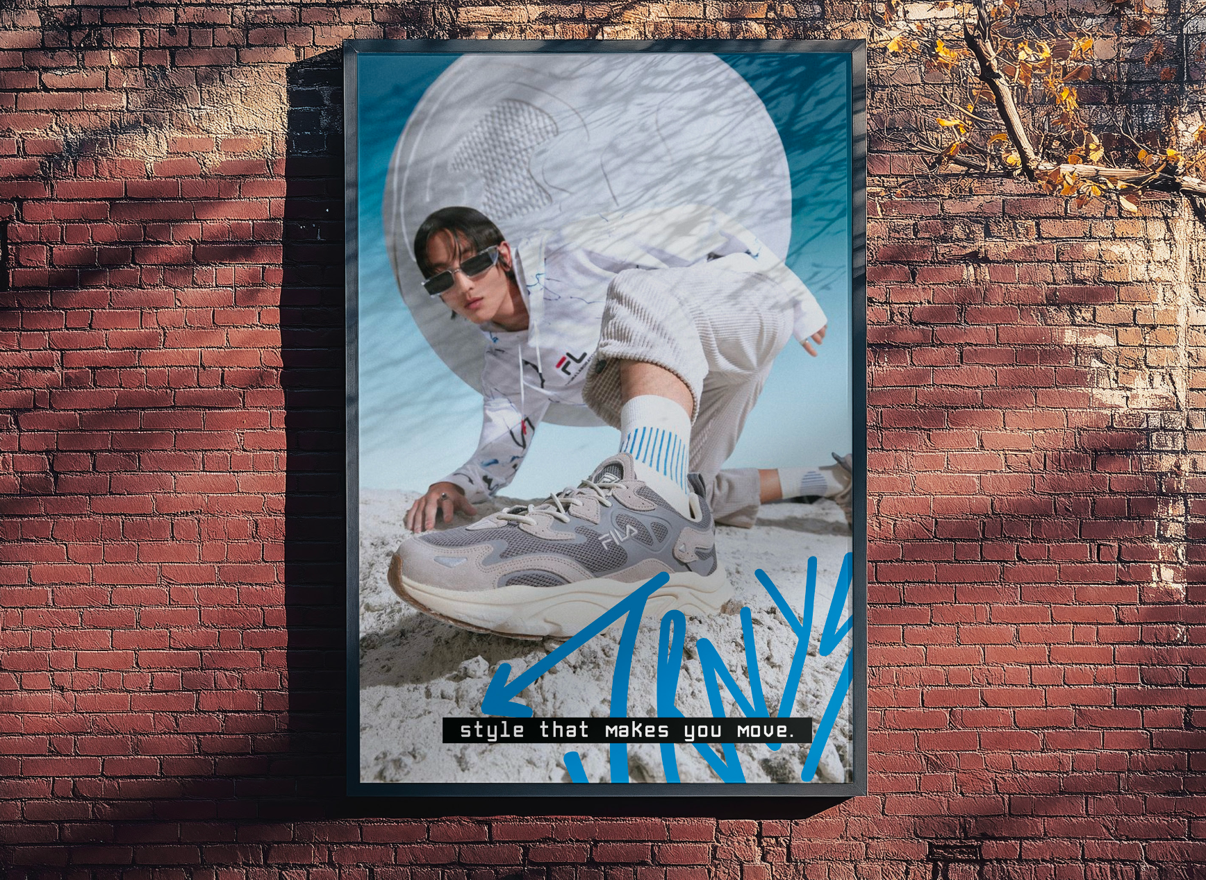
WALL POSTER DESIGNS
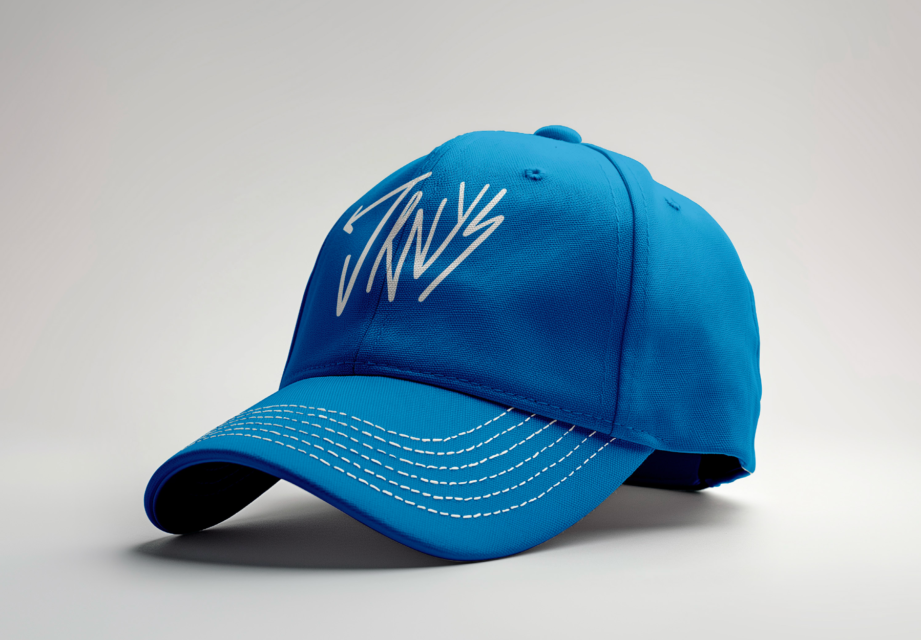
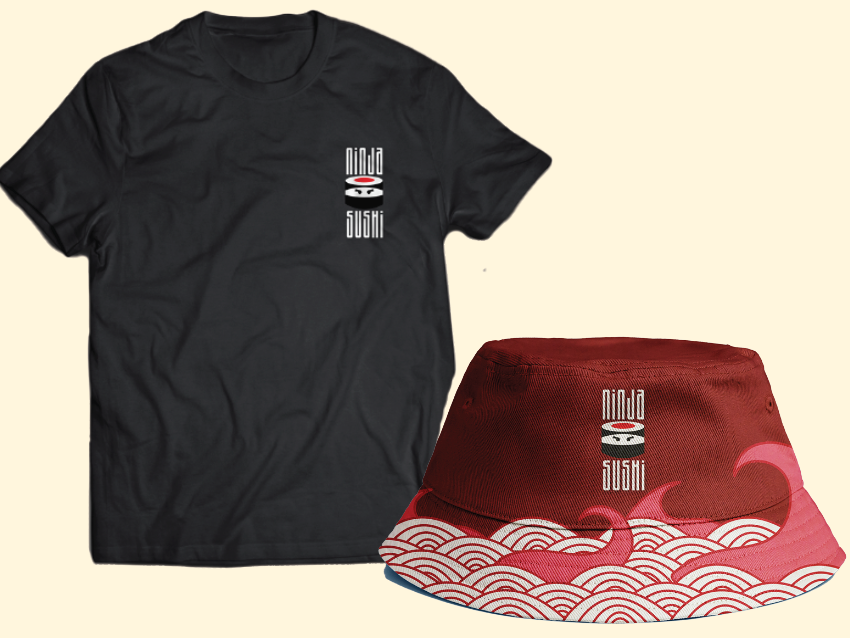
JRNYS BRANDED HAT
EMPLOYEE T-SHIRTS

BILLBOARD SIGN
Journeys has a clear opportunity to grow by redefining its image for a new generation,one that values authenticity,creativity,and cultural relevance. While the brand already has strong roots in youth fashion,its identity can evolve to feel more current and intentional.By leaning into a bold, expressive,and confident tone,the brand can better connect with a younger audience that craves individuality.
The proposed direction is driven by four core positioning adjectives: bold, youthful, edgy, and authentic. This strategy updates the brand while staying true to its rebellious roots. Each element reflects that spirit, helping transform Journeys into more than just a store but a place where real style begins and self-expression has meaning.