RESEARCH
For college students, choosing a major can be difficult, especially if the department’s brand is not established. A well-defined brand helps prospective students understand the department’s values, strengths, and culture, providing clarity and fostering confidence in their decision-making process. In the case of the Art and Design department, this rebrand project that I was tasked with was essential not just to attract students but also to reflect the creativity, vibrancy, and innovation that define its core.
I conducted an in-depth analysis of the various social media accounts managed by the Art & Design department to better understand the voice and tone they were projecting. Through this research, I identified that Bethel’s overall brand personality is inviting, warm, and strongly rooted in fostering a sense of community. In addition to that, part of my research included conducting personal interviews to gain deeper insights into perceptions surrounding the Art & Design department. These conversations revealed a range of misconceptions and stereotypes that people often associate with art and design majors. Common themes included the belief that these fields lack practical career paths or that they are less rigorous than others.
PLANNING
After conducting extensive research, I concluded that a vibrant and bright visual identity would best capture the essence of the Art & Design department. My goal was to create a look and feel that exudes a celebratory energy, emphasizing creativity, inclusivity, and excitement.
EXECUTION
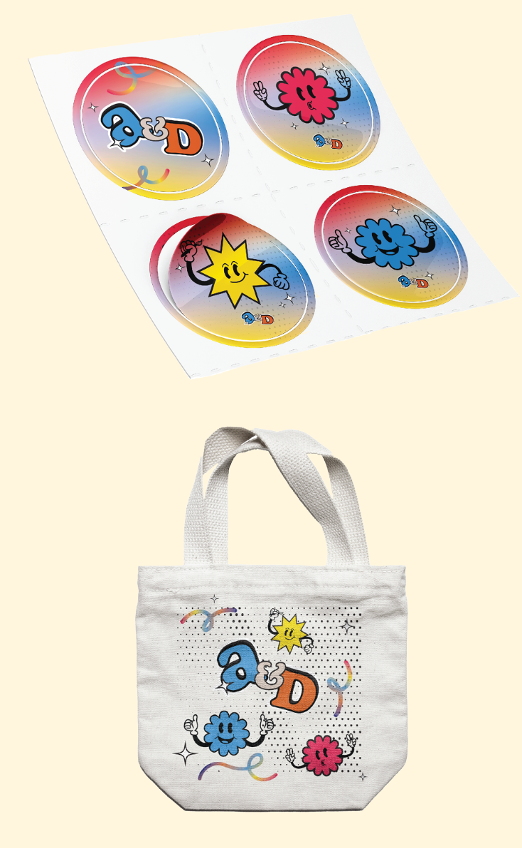
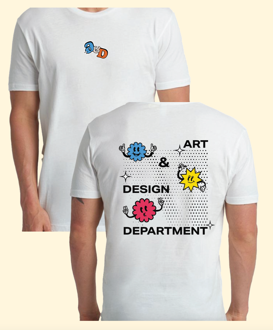
I aim to incorporate a vibrant palette of bright colors, paired with dynamic and colorful graphics, to create a visual identity that radiates energy and creativity. These elements will work together to evoke a sense of excitement and celebration, reflecting the bold and innovative spirit of the Art & Design department. By combining these design choices, I hope to create an engaging and inviting aesthetic that captures the essence of the department while inspiring both prospective and current students.
INITIAL THUMBNAILS & DRAWINGS
BRAND GUIDELINES
Z-FOLD BROCHURE FRONT
Z-FOLD BROCHURE BACK
BANNER STANDS
MERCHANDISE
SOCIAL MEDIA: INSTAGRAM POSTS & STORIES
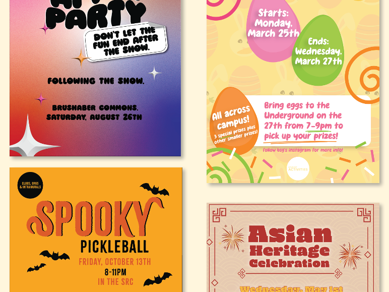
When it came to social media, I wanted it to still be consistent in tone, style, and messaging, ensuring that every post aligned with the brand’s identity and captured the target audience. One thing I knew I wanted to keep consistent on the social media was the gradient background. It served as a signature visual element that tied all the posts together, creating a cohesive and recognizable aesthetic.
Some of the goals I wanted to achieve with the social media aspect of this project included increasing engagement among followers by creating content that is not only visually appealing but also highly interactive and shareable. Playing into the theme of “celebration”, I also wanted to showcase student achievement, whether that was with current students or alumni.
